
The reason why you need a website in the first place is to grow your business. Therefore you have a message that you want to be delivered in the best way possible. Web design is that medium through which the message is delivered.
A great web design conveys the message while engaging the online visitor. The designer ensures consistency; colors, imagery, typography, and functionality are intertwined to produce a great web design.
A well-built website will help build trust and guide them to take action. Thus you must ensure that your website is made by creating a great user experience.
Here are some guidelines on creating your next web project
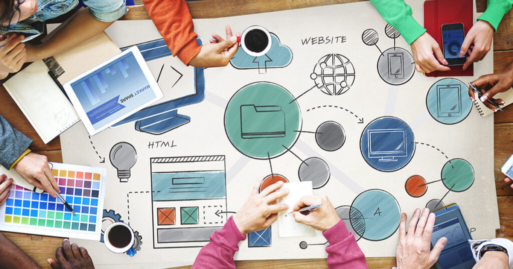
The web purpose

Source: finansije-konsalting.rs
You have an intention of what you want to offer on your website; the products and services. You’ve to ensure that the intention is so clear on all pages and that it will provide fluid interaction with your offerings. Are you selling a product, service or is it a sport or how-to-cook coverage website? The purpose of your website is what will determine the design, color mix, and imagery.
The primary purposes of websites are building reputation, describing expertise, generating leads, and aftercare.
The site’s simplicity
The most important of all considerations is enhancing the user experience and your website’s usability.
How then do you achieve simplicity?
-
The Colors
Color allows you to communicate messages while evoking emotional responses. To influence your customers’ behavior, you’ve to look for a color palette that will fit your brand. For a good effect, you need to limit the colors to a maximum of 5 colors and coloring is a major part of web design that is a crucial factor for a website’s success, according to ctrlaltcreate.co.
The use engagement increases, and they feel good when the color combinations are pleasing.
-
Type
Typography will play a significant role to play in your website. It commands attention and as well the visual interpretation of brands. Use clear and legible typefaces, and the fonts should not be more than three on your website.
-
Imagery
Imagery is every visual aspect used in a website for communication. That includes video, illustration, photography, and all graphic forms. The imagery should be expressive. It’s the first impression on every website. It presents your site as credible and professional, and therefore visitors feel endeared to it.
Site navigation
Source: ionos.com
Navigation is the ability to flip through web pages. That should be simple and well-guided. Visitors want to spend more time on websites that are easy to navigate. One thing should lead to another, and if there’s confusion, they’ll look for alternative sites.
Don’t let customers disappear because of a disorganized design. Read here and get a reputable Web Design company here to help you optimize every page and properly intertwine the different segments of your website for maximum efficiency. Keep it simple, consistent, and intuitive.
Mobile friendly
Two-thirds of online visitors do so using their mobile gadgets. Thus you have to ensure that the site is optimized for Mobile.
With perfect optimization, great content, videos, and pictorials, you’re sure of getting a share of the numbers.
Less is more
Source: ratchetandwrench.com
For an effective web design, go simple. Common sense dictates that the more choices you give people, the easier it is to choose nothing. That has never been truer for web design. Too many options can overwhelm visitors, which would increase the time it takes for them to decide. When a user visits your site, they’ve a purpose in mind. Thus you can have some fancy layouts but make sure they are not too many to distract.
Make sure you provide only information to the viewers. Why waste precious real estate with unnecessary decorations? All you need are simple, sleek designs that will make a lasting impression. That allows the user to navigate your site and quickly get the info they need. Again, don’t leave white space on your website- those empty areas dot have to be necessarily white. That includes the blank areas on the page margins, gutters between text blocks and images, or even letters and words. But remember, some space is necessary for the WebPages, so they don’t appear cluttered and thus confusing and downright off-putting. Click here to see examples of web design companies’ works for inspiration.
A picture is worth many words
Truth be said, pictures give lots of information quicker than texts and large blocks. For a practical design, images are strategically placed to guide viewers to where they want to go. They’re like arrows showing you the next shop. However, when choosing images, keep in mind the quality. You must have them in high resolution and ensure they fit the overall web style. Make sure also you include people’s faces- it’s easier for users to identify such.
Think aesthetics

Source: pexels.com
The content on your site may be great, but if your pages are not visually appealing, then you could lose conversions. There are three essential website elements for every effective website; typography, colors, and balance.
As you know, colors draw emotional responses. Thus warm tones like pink and yellow will make the site visitors excited, with the cool ones like blue and purple express warmth and tranquility.
As you choose the color palette for your site, ensure there’s the perfect balance of harmony and contrast.
Ensure consistency
Trust is earned and built with consistency. And to build trust in your website, you have to maintain consistent design elements across the board. Examples of site consistency are; having the same navigation bar on the top of each page of your website and ensuring consistent image style. Again, ensure a consistent motif throughout your entire site. Your pages may have different layouts, but matching them will make your pages enjoyable.
Allow the pages to flow.

Source: beunanimous.com
In a web design, what you’re looking for are not just some decorated pages- the information you’re giving on your pages must logically flow. People read pages in E Format, which follows most western reading patterns. They begin scanning your site from the upper left corner downwards to the left. Thus the most crucial information should be on the top left and the least important placed on the bottom left.
Do not just develop a website for the sake of it. You have to put up one that will help deliver the brand message clearly and increase conversions.


